Component Showcase: A Comprehensive Demo
This post demonstrates all the custom components available for your blog posts, including code snippets, image galleries, and more.

Welcome to the component showcase! This blog post is a live demonstration of every custom component available in our design system. These components are designed to make your content more engaging, readable, and visually appealing.
InfoBox Component
The InfoBox is perfect for highlighting important information, tips, warnings, or success messages. It supports four types: info, warning, success, and danger.
Usage
<InfoBox
  type="info"
  title="Did you know?"
  text="You can use these boxes to highlight key takeaways from your articles."
/>
Examples
Information
This is a standard information box used for general tips and neutral highlights.
Success!
Use this for positive outcomes, completed tasks, or confirming best practices.
Caution
This type is ideal for warnings or things the reader should be careful about.
Error
Use the danger type for critical errors, discouraged practices, or security risks.
PullQuote Component
The PullQuote component allows you to emphasize a specific sentence or thought within your text. It’s designed to break up long sections of text and catch the reader’s eye.
Usage
<PullQuote
  text="The quote text goes here."
  author="Author Name"
/>
Example
Design is not just what it looks like and feels like. Design is how it works.
CodeSnippet Component
For technical content, the CodeSnippet component provides a beautiful, syntax-highlighted code block with an optional title and a convenient copy-to-clipboard button.
Usage
<CodeSnippet
  title="filename.js"
  lang="javascript"
  code={`const hello = "world";`}
/>
Example
export const calculateFibonacci = (n: number): number => {
if (n <= 1) return n;
return calculateFibonacci(n - 1) + calculateFibonacci(n - 2);
};

console.log(calculateFibonacci(10)); // Output: 55
ImageGallery Component
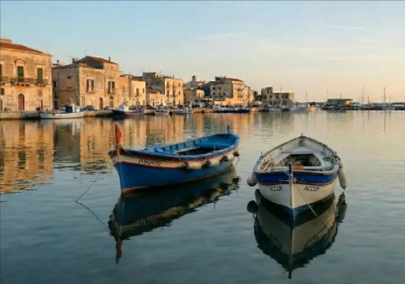
The ImageGallery component enables you to showcase a collection of images in a responsive grid. It includes a built-in lightbox that allows users to view images in full-screen mode with captions.
Usage
<ImageGallery
  images={[
    { src: "/path/to/img1.jpg", alt: "Alt text", caption: "Caption" },
    { src: "/path/to/img2.jpg", alt: "Alt text" }
  ]}
/>
Example


Conclusion
These components are ready to be used in any of your MDX blog posts. By combining them, you can create rich, interactive, and professional-looking content that keeps your audience engaged.